Card Based Web Designs
Card layouts came to the forefront of web design when web giants Facebook and Twitter each adopted card-driven interfaces for their desktop and mobile websites. Both took full advantage of container-style design to group together information despite a nearly endless stream of activity.

The best approach to understanding cards is to think of each as a singular thought. Even though they contain different images, texts, buttons, links, and other interface elements, every individual card suggests only one primary action – usually clicking through to explore content in greater detail.
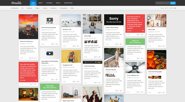
The problem with this format is the card layout can feel inconsistent with the internal or external pages you arrive at upon clicking each card. However, this style already served its purpose as the birthplace of individual containers for specific bits on content.
The philosophy broadened so that information in cards was more than links; content styles include video, images, forms and social sharing tools. In some interfaces, cards also served other purposes, including micro-interactions such as notifications.
2. Metro & Flat Design :
Coined by Microsoft, the Metro typography-based design language originated in 2006 as the earliest representation of card based flat design.

While it still retains the colorful chunked-out look of its Metro roots, Microsoft has now evolved its design language to “modern design,” which is really just a fancier way of saying “flat design.” In fact, as we described in the free e-boo website trend, flat design is again evolving by embracing the textures, shadows, and gradients previously associated with more skeuomorphic techniques.
3. Grid (or Masonry) :
The classic look of grids never really fades away.
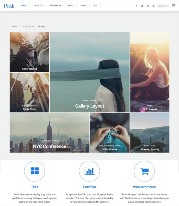
Rather than forgetting the style, designers are iterating the technique by adhering to a more strict grid or Masonry Style Framework that includes blocks of content either spaced out or connected perfectly throughout the layout. Some designers create the grid by weaving together container-style patterns, while others prefer a more purist grid to showcase images and graphics (more common in the stripped-down sites we explored in Minimalist Design Trend).
4. Magazine-Style :
While this design concept was almost exclusively used for news and magazine websites, it has also emerged as a popular option for content-heavy sites like portfolios and blogs.
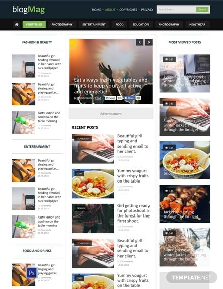
Characteristics of Magazine Style Trend include blocks featuring a “teaser” image and text linking to a full article or post elsewhere on the site. Magazine layouts are especially suitable for regularly-updated sites with large content inventories because the framework allows designers to prioritize content based on relevance (instead of just recency).
As you might imagine, magazine layouts require strong visual balance due to the multiple categories of cards. The extra work upfront, however, is definitely worth the design creates an immediate sense of familiarity and professionalism.
Conclusion
Cards aren’t just easy on the eyes – in container-style design, and in responsive and mobile design in general, they are one of the most flexible layout formats for creating consistent experiences.
If nothing else, the mindset behind card-based design stays true to the reality of web experiences. People seek out information quickly, and cards serve it up in perfect bite-sized teasers – regardless of device.
To learn more about card-based web design, check out our free e-book The Curated Collection of Design Techniques: Cards & Minimalism. The book includes 70 pages of advice explaining how to create card-style and minimalist web designs with 43 examples from Google, Microsoft, Squarespace, and more.
Comments
Post a Comment